In this photo is a picture of Kendall Jenner. I outlined this photo because it was one of my favorites taken of her. Although this was one of the most difficult for me I feel that I was still able to create it to be semi-realistic. The part I was the most proud of from this project is when I did the eyelashes and lips. This is because I feel focusing on these two parts really enhanced the reality of my project.
Monday, April 25, 2016
In this project I added a lot of my creativity. I am a business major and I am really into waking up and hustling to get stuff done. In order to get me through the day I enjoy inspirational words and quotes and drinking coffee.
In this project I took a photo from a coffee mug and cropped in the words in which I came up with myself. The outline of the coffee mug is one of my favorite quote “work hard in silence and let success be your noise.
I loved doing this video! If I am ever able to create a project where I am able to incorporate fitness into it then it always makes me happy. In this video I showed a few different workouts related to cross fit. I the showed the people in an intense workout and moved them across the screen. I added fun music to show the intensity of the workout video! In this video I grabbed photos over the internet so I did not take any of these myself.
Tuesday, April 12, 2016
I love the feeling of people free. This quote is from the song I hope you dance. This song is about inspiring people to always stay humble and positive In this picture I took images from the internet and placed it into the background photo of the ocean If you look carefully on the right hand side you can see man standing by the ocean smaller than any of the other images to help represent my quote. He is looking up at the rainbow in which is supposed to be his inspiration.
Wednesday, March 30, 2016
I truly loved doing this assignment. Fitness is something really close to my heart. Everyday I am in the gym working out. This magazine cover describes me because its colorful but simple. There is not too much going on and goes direct to the point. Whenever I read articles I do not like them being too clustered with words and images. I enjoy blank space in order to give the reader a focus on what you are trying to get out of the image itself.
On this cover the girl on the right is my idol. I look up to her for my fitness inspiration and hope to be on her level one day.
Wednesday, March 23, 2016
Wednesday, March 16, 2016
I tried to make this as a background image. Where Mickey mouse is the main focus with circles to make it look pretty. This was by far my least favorite assignment.
<!DOCTYPE HTML>
<html>
<head>
<script>
window.onload = function() {
var canvas = document.getElementById("myCanvas");
var context = canvas.getContext("2d");
////////////////////////////////////// start below this line ˇˇˇˇˇˇˇˇˇˇ
context.beginPath();
context.arc(250, 450, 100, 0, 2*Math.PI, false);
context.fillStyle = 'rgb(0, 0 ,0)';
context.fill();
context.beginPath();
context.arc(150,375, 50, 0, 2*Math.PI, false);
context.fillStyle = 'rgb(0, 0 ,0)';
context.fill();
context.beginPath();
context.arc(350,375, 50, 0, 2*Math.PI, false);
context.fillStyle = 'rgb(0, 0 ,0)';
context.fill();
context.beginPath();
context.arc(150,100, 50, 0, 2*Math.PI, false);
context.fillStyle = 'rgb(225, 225 ,0)';
context.fill();
context.beginPath();
context.arc(300,200, 50, 0, 2*Math.PI, false);
context.fillStyle = 'rgb(225, 225 ,0)';
context.fill();
context.beginPath();
context.arc(400,215, 50, 0, 2*Math.PI, false);
context.fillStyle = 'rgb(225, 225 ,0)';
context.fill();
context.beginPath();
context.arc(100,200, 50, 0, 2*Math.PI, false);
context.fillStyle = 'rgb(325, 225 ,0)';
context.fill();
context.beginPath();
context.arc(450,100, 50, 0, 2*Math.PI, false);
context.fillStyle = 'rgb(425, 225 ,0)';
context.fill();
context.beginPath();
context.moveTo(150,300);
context.bezierCurveTo(250,50,500,550,650,300);
context.strokeStyle= 'rgba(0,0,0)';
context.stroke();
context.beginPath();
context.arc(100,550, 50, 0, 2*Math.PI, false);
context.fillStyle = 'rgb(350, 350 ,0)';
context.fill();
Wednesday, February 17, 2016
Monday, February 15, 2016
Monday, February 8, 2016
In order for me to create the logo below i took a picture of globe form the internet and outlined the borders so I had a good outline of the earth. I then colored in the outline with the colors to make it look like a globe. The reasoning behind this is because the name of my business is protein world, so to be creativity i used the globe to represent it.
Monday, February 1, 2016
Critique Logos

GNC - I would make this different by incorporating something to do with the products they sell. I know the red and white are the colors of the store, but just having GNC live well in red and white it reminds me of the red cross and I would first think they sold stuff or worked in the medical field and not the fitness industry.

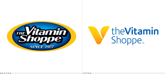
Vitamin Shoppe- I beleive that the one of the right is better for the company. I believe that the one on the left is too busy whereas the right is simple and has a good soft feel to it. If in magazine the one of the left would just blend in with the page where the less complex version would stand out.

Nutri Shop- These colors are very similar to the last logo. I also dont understand the point of the sun above the logo. I like that the explain their products within their logo, it makes them stand out from competitors.

Discount Nutrition- This look identical to the last logo, definitely way to close to competition especially since the nutri shop is more known. This logo looks like they just copied nutri shop which doesnt help them as a business. They should completely re desgin their logo. A good start would be maybe a minus sin the count nutrition.

- Total Nutrition- I like this logo alot. I believe that it is simple and to the point. I like how for their differnt locations they add the first letter of the location in it for example the one in tampa is the same logo then a T at the end. The only thing i would think about adding is a sot of symbol of what they sell maybe a shaker cup so people who dont know about them can have an idea of what type of store it is.

GNC - I would make this different by incorporating something to do with the products they sell. I know the red and white are the colors of the store, but just having GNC live well in red and white it reminds me of the red cross and I would first think they sold stuff or worked in the medical field and not the fitness industry.

Vitamin Shoppe- I beleive that the one of the right is better for the company. I believe that the one on the left is too busy whereas the right is simple and has a good soft feel to it. If in magazine the one of the left would just blend in with the page where the less complex version would stand out.

Nutri Shop- These colors are very similar to the last logo. I also dont understand the point of the sun above the logo. I like that the explain their products within their logo, it makes them stand out from competitors.
Discount Nutrition- This look identical to the last logo, definitely way to close to competition especially since the nutri shop is more known. This logo looks like they just copied nutri shop which doesnt help them as a business. They should completely re desgin their logo. A good start would be maybe a minus sin the count nutrition.

- Total Nutrition- I like this logo alot. I believe that it is simple and to the point. I like how for their differnt locations they add the first letter of the location in it for example the one in tampa is the same logo then a T at the end. The only thing i would think about adding is a sot of symbol of what they sell maybe a shaker cup so people who dont know about them can have an idea of what type of store it is.
Monday, January 25, 2016
My name is Alicia Waldner. I am currently a marketing major in my junior year. I have been working at a Medical Marketing firm for a year now and hope to stay with them. In this class I expect to learn how to use illustrator and photoshop. Gaining this skill I can move further in my company, but helping our creative team.
Subscribe to:
Posts (Atom)


